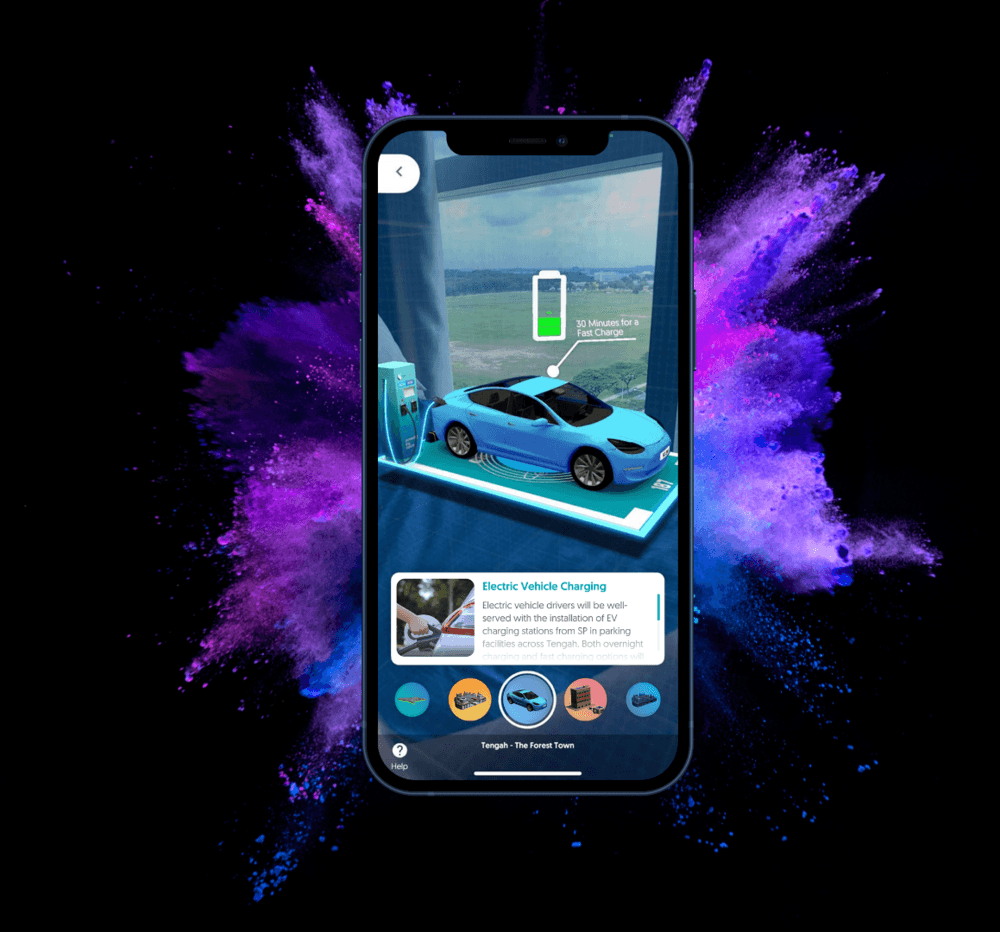
AR
Touch Interface
Mobile App
Role
Digital Art Director
Timeline
1 Year

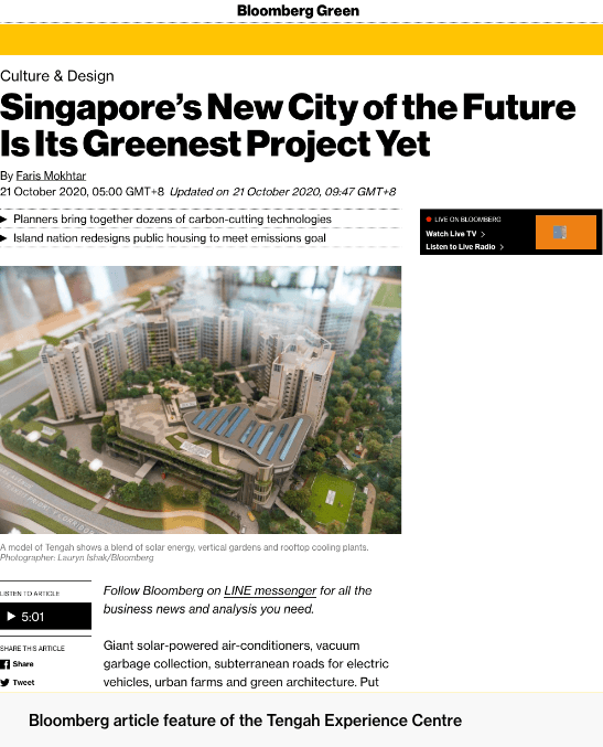
About The Project
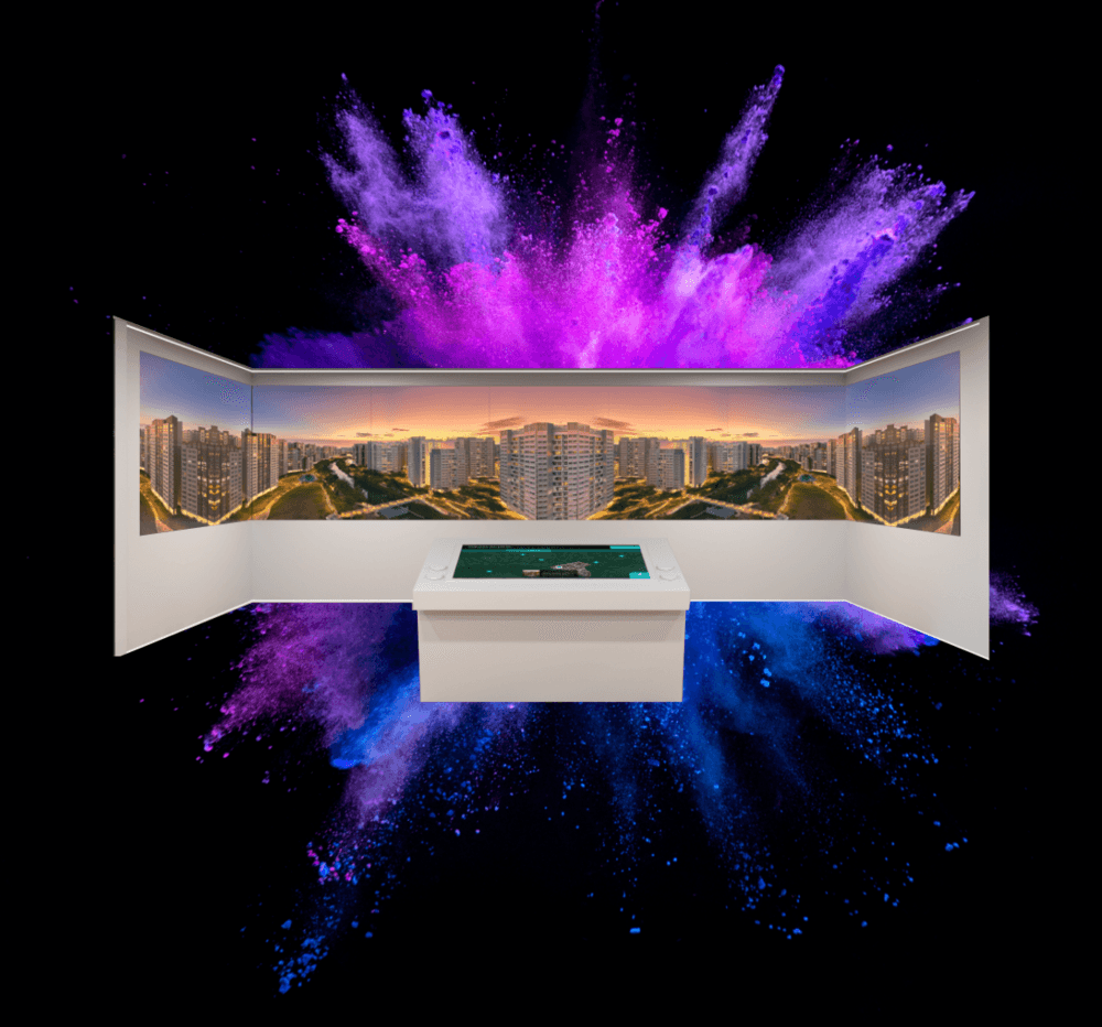
The MyTengah Experience Centre is a physical exhibit designed to educate the general public on the benefits of sustainable choices and the features of Singapore's first eco-smart township, Tengah.
The centre includes multiple touchpoints for visitors to interact with and tracks user information to better understand the needs and interests of attendees. Through this immersive experience, we aim to promote the adoption of sustainable practices and raise awareness about Tengah as a model for eco-friendly living.
Visit The Centre
Download The App


The Challenge

Cynthia Wong
Vice President, Sustainable Energy Solutions @ SP Group
The Process
We used research to understand the needs and desires of our target users and the competitive landscape. Using this information, we defined specific problems that our product would aim to solve. We generated and refined potential solutions through prototyping and testing, and then moved on to the final product development phase to create the final design and prepare it for manufacturing within the centre.
View the methods used in this project
▪ Market Research ▪ Client Interviews ▪ User Interviews ▪ Affinity Mapping ▪ User Personas ▪ User Journey Mapping ▪ Service Blueprint ▪ Sitemap Crafting ▪ Wireframing ▪ User Flows ▪ Prototyping ▪ User Testing


Benchmarking Beyond
Singapore
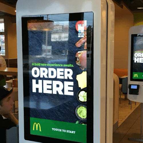
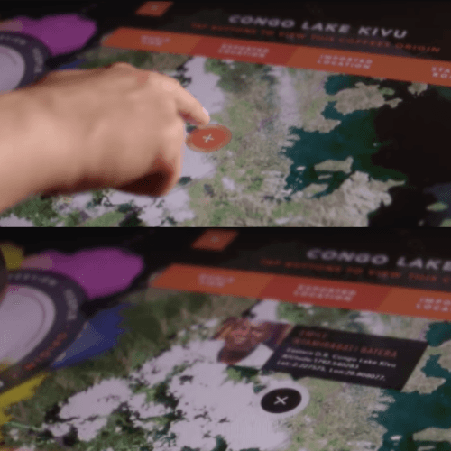
To make the concept of sustainability more tangible for our audience, we decided to use augmented reality and 3D visual graphics as a key feature in our products. We also considered how gamification could add a more personal touch to the experience for each user, potentially lowering the friction of capturing user data at the start of the experience if it were used as a reward mechanism. In order to inform our design decisions, we looked to successful examples of augmented reality, touch screens, and touch tables in companies such as Instagram, McDonald's, and Starbucks.

Taking The Good &
Learning From The Bad
Instagram's interface helped us understand how to narrow and scope the AR mechanic, while McDonald's ordering kiosks provided insight on structuring touch screen interfaces.
Starbucks' touch table interface was particularly helpful in shaping the user interface and mechanics of the SP Group Touch Table, as it gave us an understanding of what the general public would already be accustomed to and how to create a user-friendly interface for uncommon mediums.

What Matters To The Business?
As this was a project involving multiple products, it was important for us to gather as much information as possible about its progress. To do this, we consulted with various departments such as Marketing, Digital, Electric Vehicle, and Sustainability.
By speaking with these teams, we were able to get a better sense of how the project was progressing and how each product fit into the larger picture. This helped us make informed decisions about the direction of the project and it's needs to ensure that it was on track to meet its goals.

Users have little understanding of our eco-solutions
It is difficult to relay intangible elements such as carbon, sunlight, and energy through education materials.

It's hard for users to switch to new technologies
They suspect their bills will be higher if they switch to eco-tech.

There's no system to track potential customers
They don't have the contact of users interested in switching to eco-tech.
What Did The Users Think?
Did you know about the sustainability and smart technology efforts in Tengah?
A whopping 72% of users were not aware of Tengah's capabilities in eco-smart technologies.
Do you understand what a centralised cooling system is & how it works?
Unsurprisingly, 95% of the participants did not understand what a centralised cooling system was. Interestingly, 82% of them did not even know it existed.
Do you know why it is important for Tengah to be a green town?
Majority were aware of the importance of being environmentally conscious, however, a sizeable 24% did not see the need for Tengah to be eco-friendly.
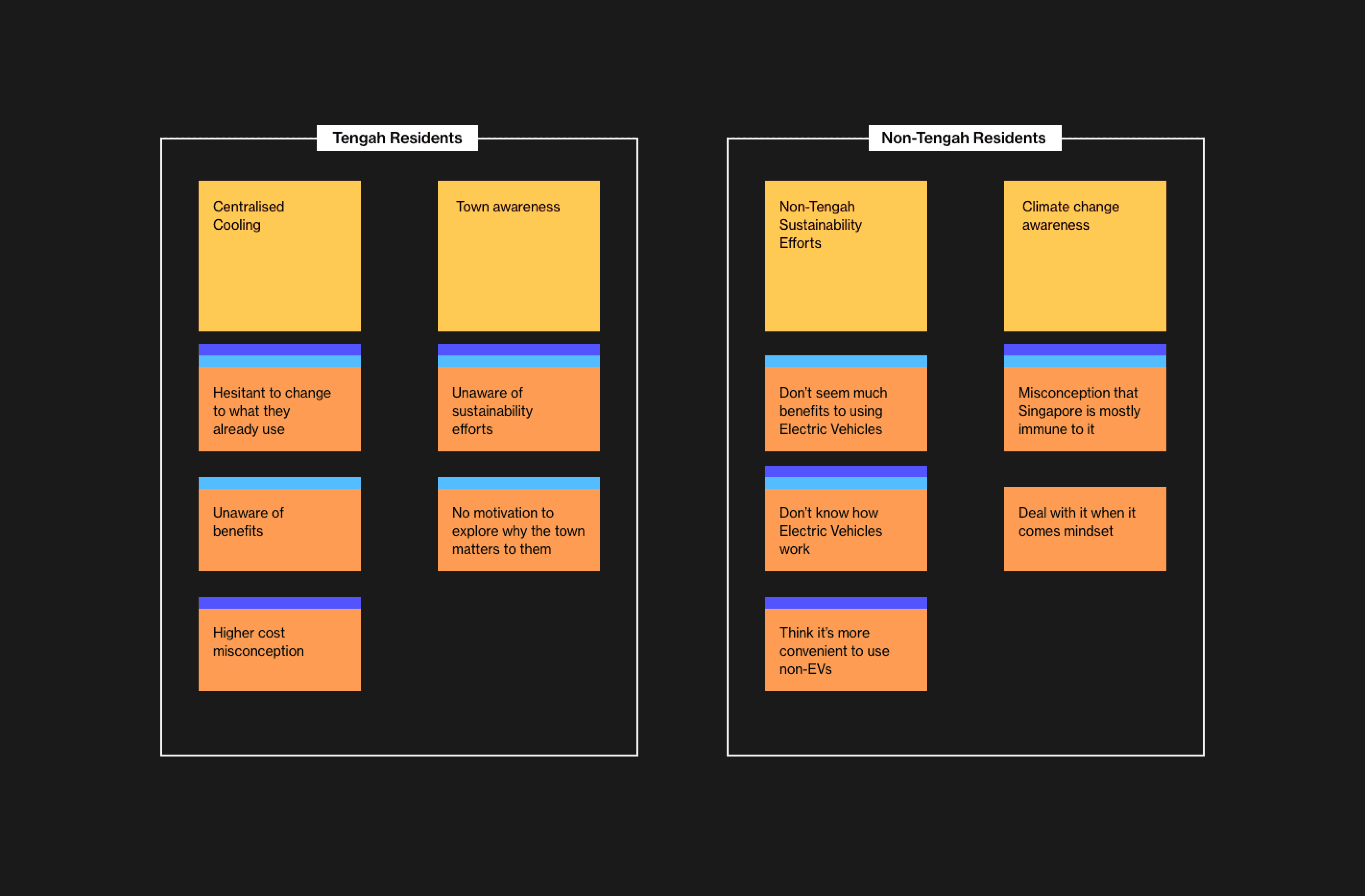
Visualising The End-user
The user interviews conducted above sort of blew our minds with unexpected findings. From there, we took a systematic approach to create an affinity map to split the findings between soon-to-be Tengah residents, and the casual browser.
Then we dived deeper through user personas and a journey map to empathise with their needs at each stage.

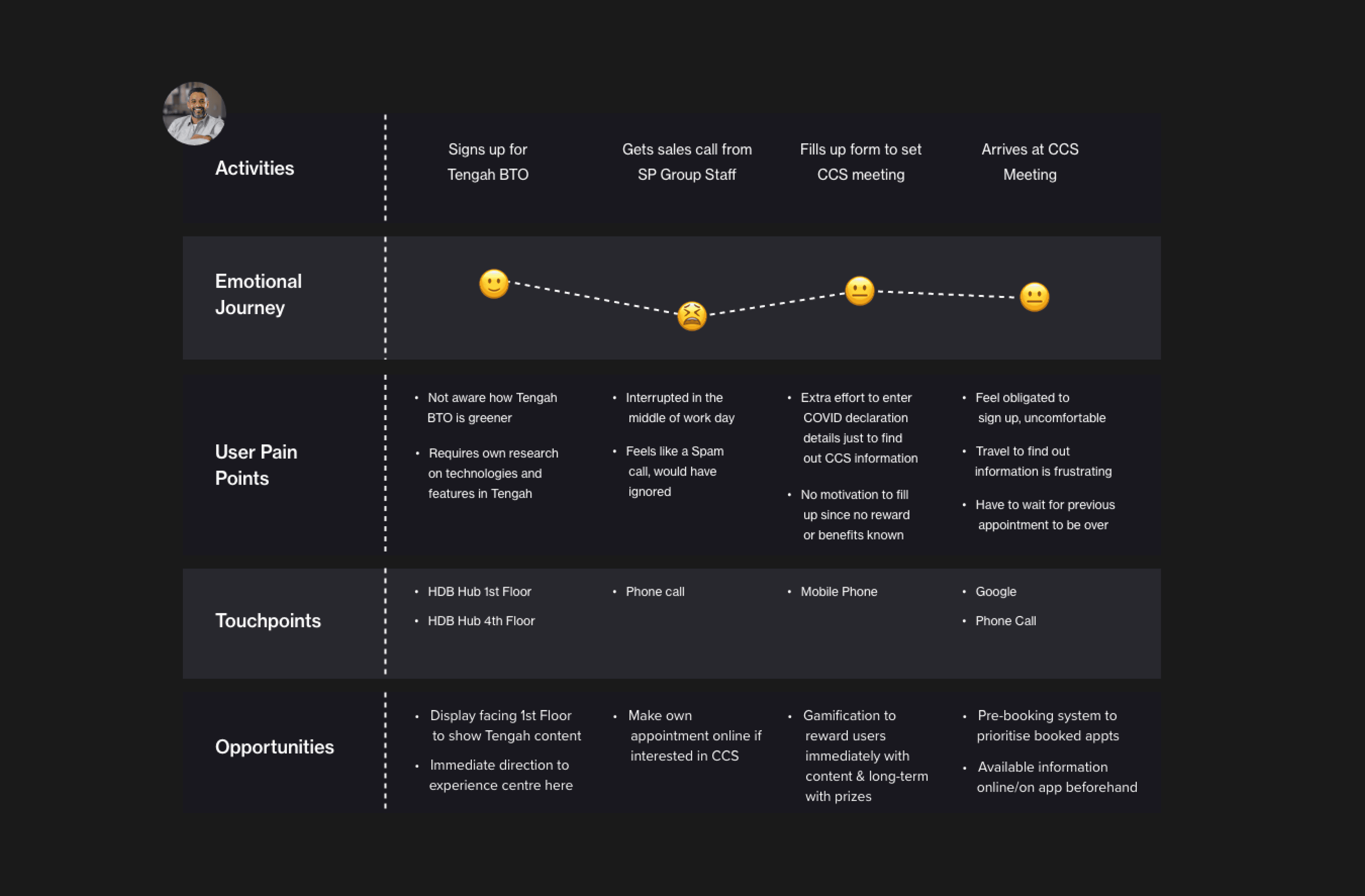

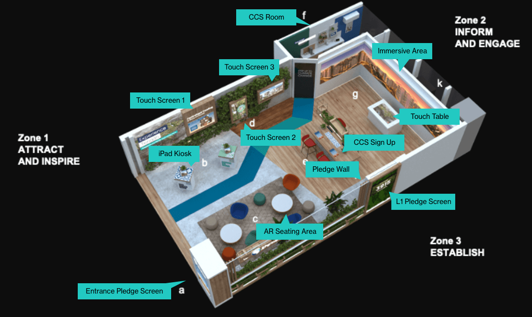
The Physical Journey
We worked together with the architecture team to design a point-by-point journey through the centre that educated the user about Tengah in a bite-sized manner.
The tactic was to split the centre into 3 zones:
Zone 1: Attract & Inspire
Zone 2: Inform & Engage
Zone 3: Establish

Service Blueprint
To create the service blueprint, we first mapped out the interactions and flow between each touchpoint in a customer's journey. We then prototyped the full user journey to visualize the micro-interactions and identify any potential friction points.
This process helps developers understand the desired user experience and can reduce issues during development and testing.

Clarity With Sitemaps
To ensure that the flow of information in the project was coherent and logical, we decided to create a full schematic of its information architecture. This was necessary because of the extent of the project and the multiple touchpoints involved. By mapping out the information architecture, we could make sure that the flow of information made sense and was easy for users to follow.

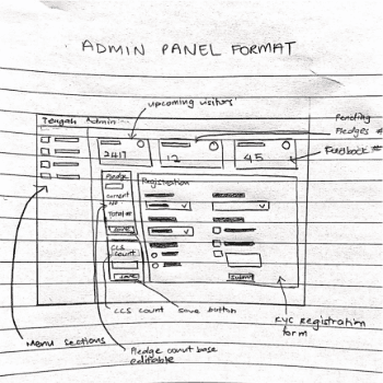
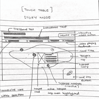
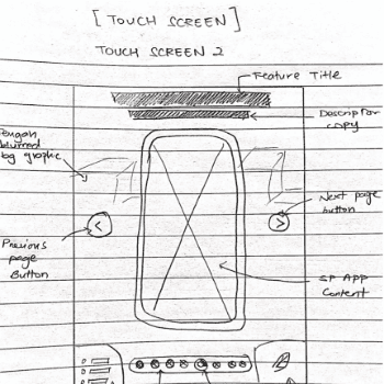
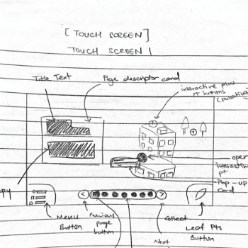
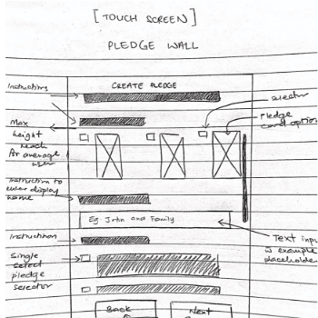
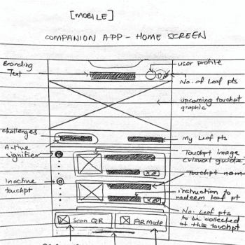
Time to Sketch Away
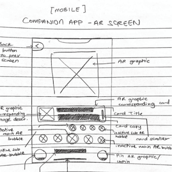
Before we dove headfirst into the project, we all got together and sketched out each touchpoint on paper. We did this to make sure everyone was on the same page about what we could feasibly include in the project from the get-go.


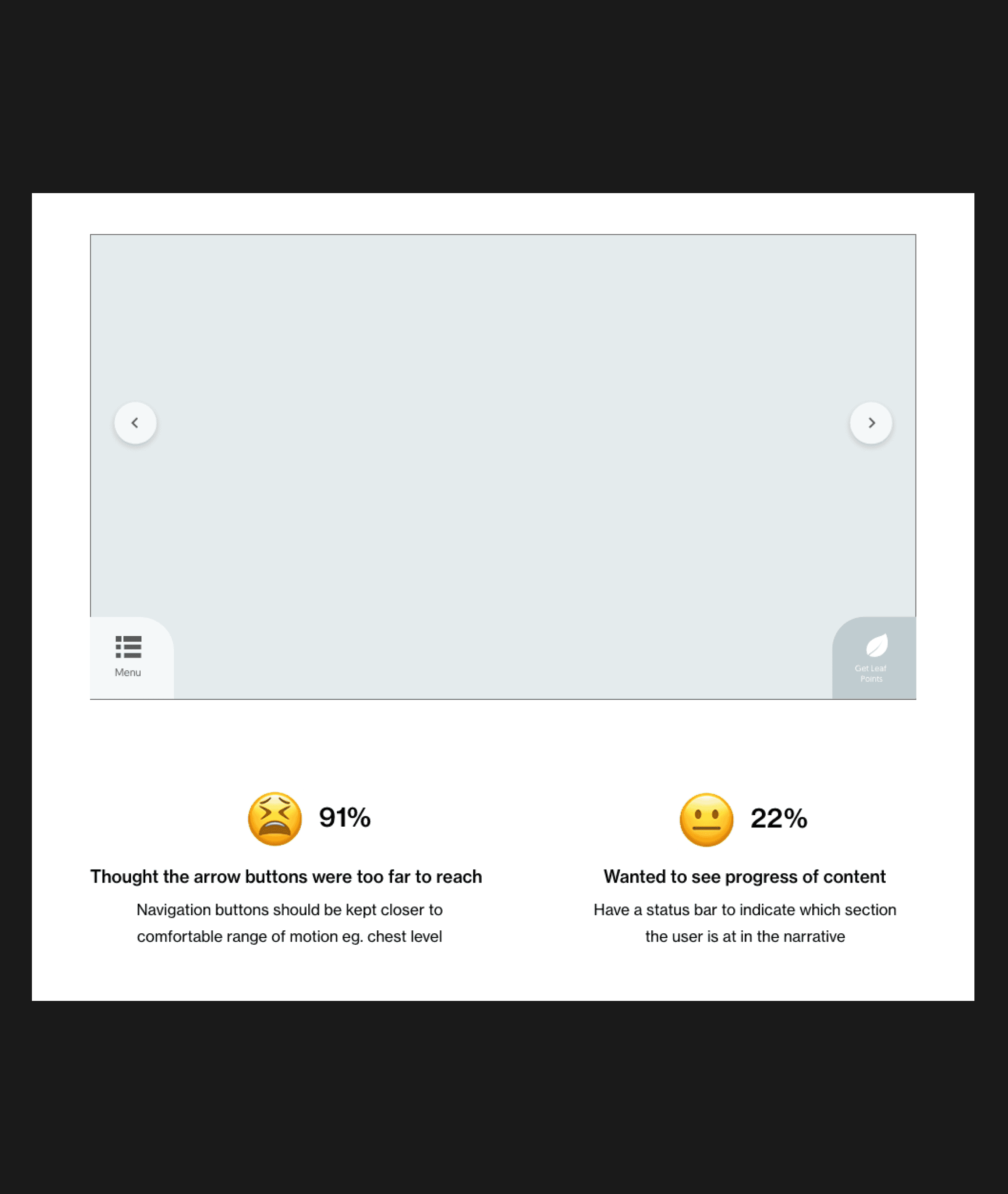
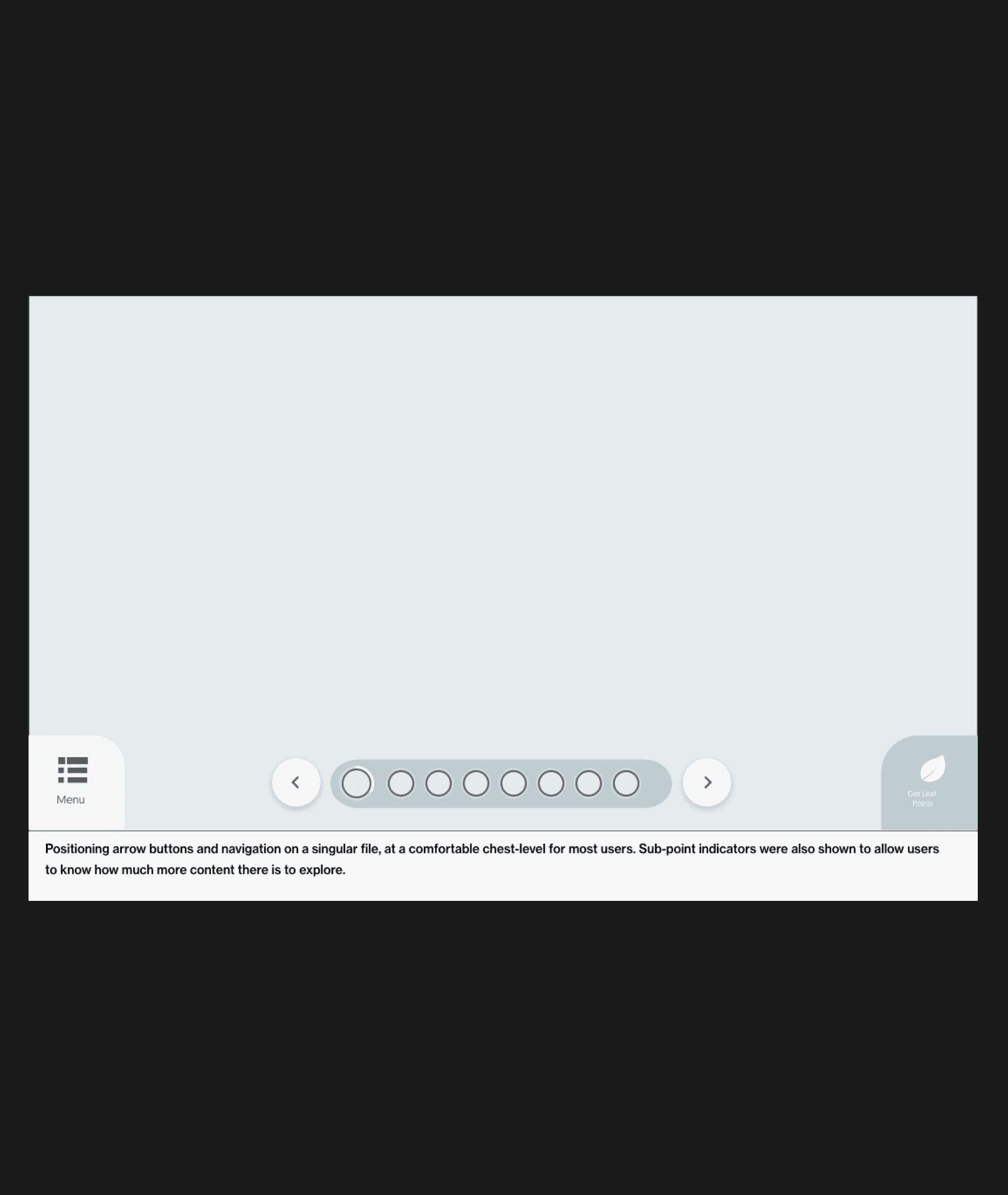
Testing Concepts with Lo-fi
To make sure we were keeping the end-user front and center, we whipped up some basic wireframes for each touchpoint and had the focus group try them out. We wanted to see if they could easily get things done and find important features. Plus, we wanted their thoughts on how we could make their experience with our products even better.


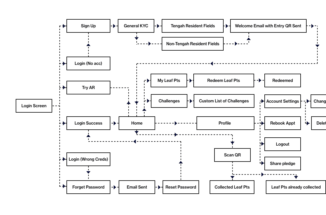
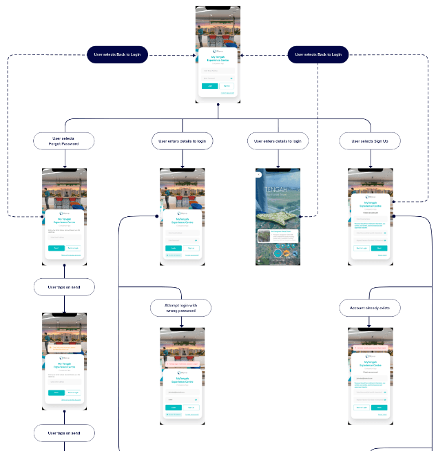
Alignment with User Flows
To kickstart the development team, we sent them the low-fidelity wireframes so they could get a sense of what features were necessary. Then, we gave them a basic box-style user flow to help them understand how all the screens would fit together. Once that was done, we built the full-scale prototype and handed over the complete user flow for them to reference easily as they built the project.
The Results
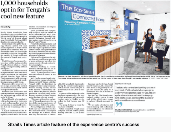
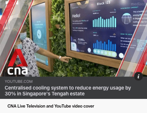
SP Group's centralised cooling system has a 90% sign-up rate due to the engaging journey we created both inside and outside the experience centre. The project's success surpassed our expectations and resulted in features on Bloomberg, Channel 8, CNA, and recognition from the Prime Minister of Singapore, Mr Lee Hsien Loong.